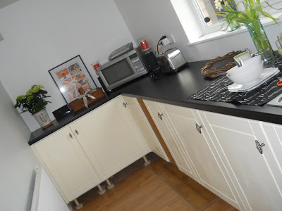
Can you remember me telling you my grand plans for a credit crunching, planet saving, brand new recycled kitchen? I called it "Operation Silk Purse" as we were trying to make it out of a "sows ear". Well, I thought I would show you how it was evolving. This used to be the dining end of the kitchen, but it was never quite big enough for us to all get around the table comfortably and the table became a dumping ground for bags, dirty pots etc etc and made the room look a mess. The table has been recycled into the garden and all the units in here were "
wombled" from my friends house as she was having a new kitchen. The doors were purchased really cheaply in the B&Q sale when they had 60% off and are a very similar style to the existing kitchen doors (which I couldn't replace as they are an old and odd size). Once painted up, you just don't notice the difference. I'm going to put a couple of shelves up at this side of the kitchen, but I'm hoping to find some old wood to re-use.

Ive had to have new worktops as they no longer did the ones I had before. That has bumped the cost up more than I intended, but its does look more modern and swish. We used the same handles. I changed them a few years back and had spares as I got a bargain big bag!

These shelves were originally here, so they have had a lick of paint too, and I am going to treat myself to new
floor covering eventually, but no hurry. We have a concrete floor, otherwise I would have been tempted to paint it.

Instead of dashing out to buy new
accessories, I decided to use what I already had a bit better. I have several of these large dishes. They came from my Grandads house and I think they had belonged to my great Grandmother.

My sister gave me this a few years ago,

And this was a keepsake from a great Aunt that I kept after she died.

I have a dilemma now. I am going to have a row of tiles
all way around, and a few rows behind the sink as a splash back. I originally wanted white as I loved the ones in Sophie
Dahls kitchen, and all the ones in the Swedish kitchens - but we foolishly brought a black one to try as well, and I can't make my mind up now!
 Ive had to have new worktops as they no longer did the ones I had before. That has bumped the cost up more than I intended, but its does look more modern and swish. We used the same handles. I changed them a few years back and had spares as I got a bargain big bag!
  These shelves were originally here, so they have had a lick of paint too, and I am going to treat myself to new floor covering eventually, but no hurry. We have a concrete floor, otherwise I would have been tempted to paint it.
  Instead of dashing out to buy new accessories, I decided to use what I already had a bit better. I have several of these large dishes. They came from my Grandads house and I think they had belonged to my great Grandmother.
  My sister gave me this a few years ago,
  And this was a keepsake from a great Aunt that I kept after she died.
  I have a dilemma now. I am going to have a row of tiles all way around, and a few rows behind the sink as a splash back. I originally wanted white as I loved the ones in Sophie Dahls kitchen, and all the ones in the Swedish kitchens - but we foolishly brought a black one to try as well, and I can't make my mind up now!
32 comments:
Your Kitchen is looking great Diane. I love the cream door and the sentimental bits and bobs . Well done on the wombling :0)
Jacquie x
It's looking good! I love your fairy lights!
xxx
Looks lovely and I love the picture o n your worktop!
B xxx
for what its worth diane i would go for the white in a brick effect....love the shelves with all your bits and bobs.... that china is lovely x
It's coming along beautifully and I love the open shelves. My eye is on the flow blue dish too. Have a lovely weekend x
Thats looking very silk purse you have done a great job. Sure I have seen paint somewhere for concrete floors. Have a good weekend.
Looking good!
If you are doing just 1 row of tiles, I would go mainly white with a random black one inbetween. If you are doing a few rows I would go white.
Vanessa x
Beautiful Diane. Love your family bits and bobs,they give kitchens personality. Well Done you.
Wow - that is looking ACE! I would love to do a paint job on our kitchen to tide us over till we can replace it - but I fear it is even beyond Sows Ear status... I would end up with a wooly jumper as opposed to a Silk Purse :(
Well done - and I would go for the white brick tile
Clare
x
Loved the new look in your kitchen & the colourful china looked great against the black worktop.
Love your kitchen Diane-and all of your bits and bobs -they look great and add lots of character ! you`ve done a grand job ! black tiles -I think ?! x
Looks fab Diane, we use our table as a dumping round - in fact we use most surfaces as dumping rounds - oops !!
twiggy x
I was hoping to see you wearing an apron and cooking us one of your special recipes!
The kitchen is looking great, well done you!
xxxxx
it's looking great , we've got the white brick effect and I love it ..
It looks great! Love your art deco vase and butter dish.
You have been working hard it all looks wonderful you must be pleased that it is getting near to completion. I love all you family heirlooms:)
Your kitchen looks great, the doors look very similar to ours. We have a dark worktop and went with white tiles x
Love the wine rack!!! White I feel?
Fair made £253.00 in about 1/2 hr!!xx Nic
Looking great Diane, well done!
I would do a row of black next to the woktop then two rows os white, but thats my own opinion, I know you didn't ask but thought I would stick it in anyway!
love
Lyn
xxx
The kitchen looks really good - worth the wombling & the wait to get it done!
?Sharrow Vale road for some nice shelves?? I love the second hnd thrifty furniture shop there!
I have the white brick tiles in the laundry room & I love them!
Thankyou for your very fabby comment today
Lx
PS 'Only' 45 mins from me to Barnsley!
Looking good!
I like your vintage accessories too.
I would go for white tiles too, keep it simples!
Sandie xx
Your wombled kitchen is looking very swish Madame C! It's lovely that the bits and pieces you have dotted around come from family and have memories for you.
I would go for the white ones, just love those tiles!
You'll have to let me know how the SM show was seeing as you're going to go before us.
Have a fab weekend my lovely.
Lisa xx
I have plates in exactly the same pattern as your cheese cover!
as for comedian greg davies..I saw him years ago....all remember was that he laughed alot and was incredibly tall!
Your kitchen is looking great, I love that you used existing things to greater effect and glad to see you got the heart in there somewhere! I say white.
Happy weekend x
It looks so good, very modern, streamlined and just a touch of vintage.
Your kitchen is looking great! I can't advise on the tiles as I still haven't decided on what tiles to put up more than 3 years since having my kitchen put in!!! x
It looks great, I love all your bits and pieces. I have a black worktop with black and white tiles.
Great look. I have black tiles in my bathroom (closet Goth!) :O)
Very swish Diane!!
Kitchen is looking great Diane. I like the mix of modern and antique. A real modern look is to keep the concrete floor. You could always try and paint it with special paint and if you don't like then you can still go for a new floor. Now the hardest part is to keep it de-cluttered! I love the green plants in the kitchen and your heart! My advice: the white tile. Thanks for showing! xxxx
It looks lovely - and I agree with the commenter above - the hardest thing is to stop the clutter coming back!
Beautiful kitchen I like it.
Post a Comment